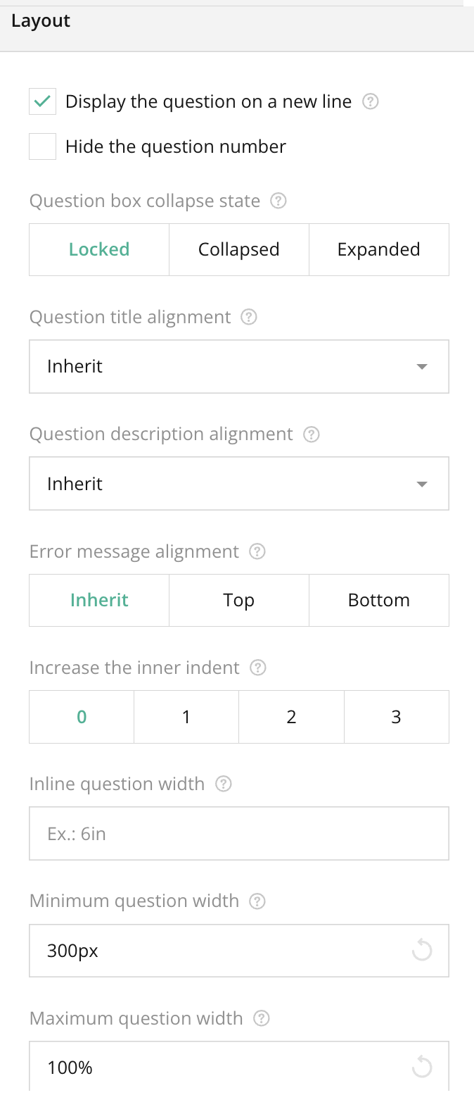
Overview
The Layout Section under Individual Question Settings allows for fine-tuning the appearance and positioning of each question within a survey. This section provides tools to adjust the alignment of the question’s elements (title, description, and error messages), manage how the question box behaves (e.g., collapsed or expanded), and control the width and indentation of questions. By customizing these settings, you can enhance the readability and visual flow of the survey, improving the overall user experience.
Key Features
- Display the question on a new line: Ensure that the selected question appears on a new line instead of inline with other questions.
- Hide the question number: Optionally remove the automatic numbering from the question, making the survey less formal or structured.
- Question box collapse state: Choose how the question box appears initially:
- Locked: The question remains open, with no option for users to collapse it.
- Collapsed: Starts collapsed, and the user needs to expand it to view the content.
- Expanded: Starts expanded, but can be collapsed if necessary.
- Question title alignment: Allows setting the title alignment to Top, Bottom, or Left, or it can inherit the global alignment settings.
- Question description alignment: Similar to title alignment, but controls the placement of the question’s description text.
- Error message alignment: Adjusts where error messages appear relative to the question (inherit from global, Top, or Bottom).
- Increase the inner indent: Adds more space inside the question box, creating visual padding.
- Inline question width: Sets the width of questions that are displayed inline with others, allowing for more compact layouts.
- Minimum and Maximum question width: Specifies the size range for the question in pixels or percentages, giving more control over the layout.
- Column count: Defines the number of columns for the question display, useful for more complex survey layouts with multiple side-by-side questions.
Tips for Using
- Display the question on a new line: Use this option for cleaner layouts, especially for lengthy questions or questions with multiple answer options.
- Hide the question number: In quizzes or surveys where question order isn’t important, hiding the question number can reduce the psychological impact of long forms.
- Question box collapse state: Use the collapsed option to hide less important questions or optional sections, giving the survey a more organized look.
- Error message alignment: Position error messages based on your design needs; typically, error messages are best displayed close to the question they refer to, either at the Top or Bottom.
- Column count: For surveys designed for larger screens, using multiple columns can save space and reduce the amount of scrolling.
Summary
The Layout Section is a powerful tool for customizing the look and feel of individual questions in your survey. By controlling the positioning of elements like question titles, descriptions, and error messages, and adjusting the width and alignment of questions, you can create a visually appealing and user-friendly survey. These settings are especially useful when designing surveys for different devices and screen sizes, ensuring a smooth and responsive experience for users.
Right panel – Layout Section FAQ
How does setting 'Minimum and Maximum question width' affect the layout?
These settings allow you to control how much space a question takes up within the form. This is useful for making sure your questions fit well on both small and large screens, providing a responsive design.
What is the impact of changing the 'Question title alignment'?
Changing the title alignment can affect readability and flow. For example, aligning the title to the left or top can make it more visually connected to the question, while a bottom alignment can create a more minimalistic design.