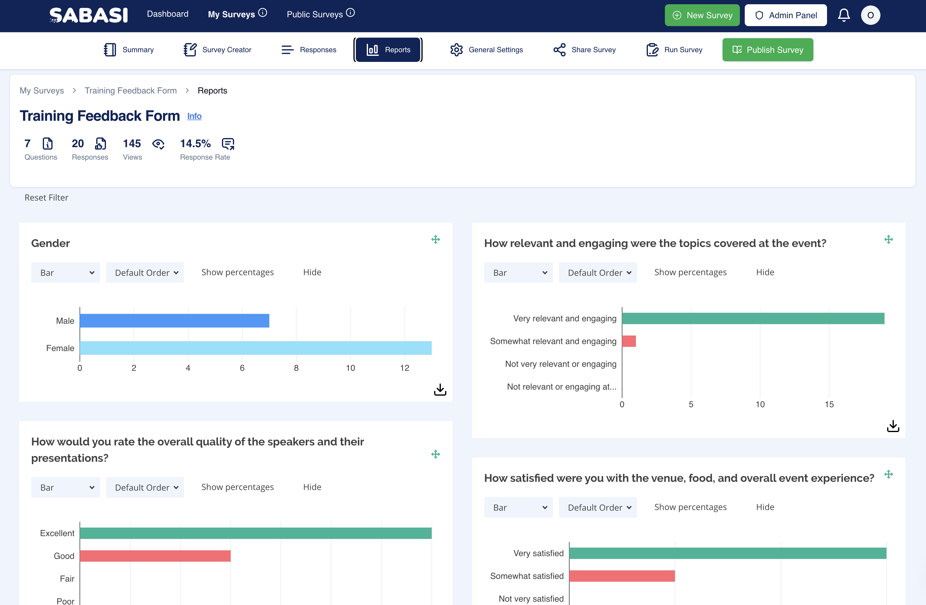
Overview
The Reports Section provides an in-depth analysis of survey responses through various visual widgets. Each widget represents a question from the survey and allows the user to customize how the data is displayed, offering flexibility for detailed insights. The purpose of this section is to provide easy-to-understand visual feedback on the collected data.
Key Features
- Customizable Widgets:
- The widgets displayed on the report can be moved or rearranged by dragging them to different parts of the dashboard, allowing the user to customize the layout according to their preferences.
- Multiple Chart Types:
- Each widget can display data in various chart forms (e.g., Bar, Vertical Bar, Pie, Doughnut, Scatter). Users can switch between these formats using the dropdown menu provided in each widget. This feature provides flexibility in data representation.
- Download Widgets:
- Every widget comes with a download option, allowing users to export the visual representation of the data as images. This feature is particularly useful for reporting or presentation purposes.
- Wordcloud Visualization:
- For qualitative data, a word cloud visualization can be generated. This visually highlights the most common words or phrases submitted by respondents.
- Percentage View:
- For certain chart types, you can toggle between showing the actual numbers and showing the responses as percentages, giving more clarity depending on the reporting needs.
- Reset Filters:
- The report section includes a “Reset Filter” option, which allows users to reset any applied filters and view the unfiltered results.
Tips for Using the Reports Section
- Rearranging Widgets: To optimize your view, drag the most relevant or important charts to the top. This makes them easily accessible when reviewing the report.
- Switching Chart Types: Experiment with different chart types to find the most insightful view of your data. Some data might make more sense as a pie chart, while others might be better visualized as a bar chart.
- Word Cloud for Insights: For open-ended or qualitative responses, use the word cloud to quickly spot trends in feedback. Larger words indicate more frequent mentions.
- Download Charts: Use the download feature for easy export when preparing reports or presentations. This can save time from manually recreating visuals elsewhere.
- Using Percentages: When presenting data to an audience, switch to percentage views for better clarity, especially when dealing with large numbers of responses.
Summary
The Reports Section in Sabasi provides comprehensive tools for visualizing and analyzing survey results. With customizable widgets, multiple chart formats, downloadable images, and qualitative visualizations like word clouds, users have a versatile toolkit to extract meaningful insights from their survey data.
How do I switch the chart type in a widget?
Click on the dropdown menu inside the widget and select the preferred chart type from the list.
Can I download all the widgets at once?
No, each widget must be downloaded individually. However, this gives flexibility in choosing which data points you want to focus on.
How do I switch back to the default layout after rearranging widgets?
The report section does not have a 'default layout' button. You will need to manually rearrange them or refresh the page.
How do I ensure accurate visual representation in large datasets?
Switch between chart types to see which gives the clearest representation, and consider using percentages to balance out large response counts.